10 Logo Design Mistakes to Avoid in 2025
Introduction
Your logo is the face of your brand. It’s often the first impression a potential client or customer gets, and it must convey the right message. Yet, countless businesses fall into the trap of common pitfalls that severely weaken their visual identity. If you’re serious about building a recognizable and trustworthy brand, knowing the logo design mistakes to avoid in USA is essential.
Whether you’re a designer, business owner, or agency executive, this comprehensive guide will help you identify and rectify design flaws that could be sabotaging your branding efforts.
Why Your Logo Might Be Hurting Your Brand
In today’s saturated market, standing out requires more than just looking good. Your logo must perform on multiple levels: emotional impact, functionality, clarity, and memorability. Making even a minor misstep in design can lead to confusion, a lack of professionalism, or even lost business.
Imagine spending thousands on marketing only for people to forget your brand because your logo wasn’t up to par. The good news? These mistakes are avoidable.
The Top 10 Logo Design Mistakes to Avoid in USA
1. Overcomplicating the Design
Logos should be simple, clean, and versatile. A complex design might look appealing in a large format but loses impact in smaller sizes.
Avoid:
- Too many colors or gradients
- Intricate patterns
- Excessive text
Instead:
- Use minimalistic icons
- Limit the color palette
- Ensure legibility in all sizes
2. Neglecting Scalability
Your logo should look good on a billboard and a business card. If it doesn’t scale well, it’s a design failure.
Tip: Always test your logo at different sizes and in various formats before finalizing it.
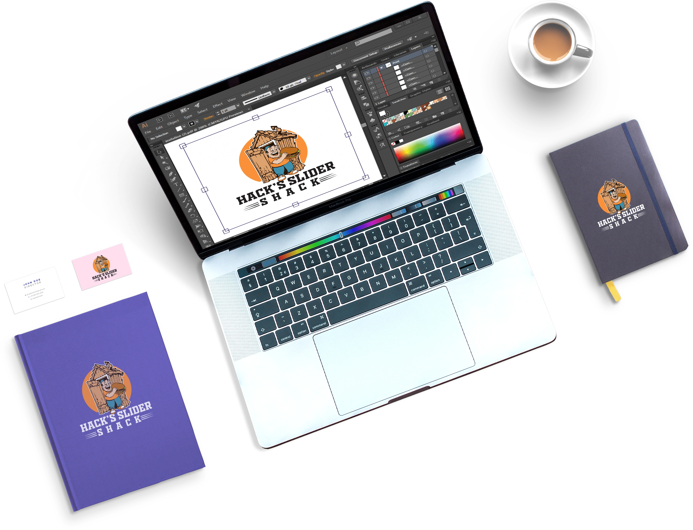
3. Using Raster Graphics Instead of Vector
Raster images pixelate when scaled, while vector graphics maintain quality. Using raster logos restricts flexibility and professionalism.
Solution: Always design and deliver logos in vector formats like SVG, AI, or EPS.
4. Choosing the Wrong Font
Typography plays a critical role in logo effectiveness. A poor font choice can make your brand look outdated or untrustworthy.
Avoid fonts that are:
- Overused (e.g., Comic Sans)
- Hard to read
- Too ornamental
5. Following Trends Too Closely
Trends fade. Your logo shouldn’t.
A trendy logo may look current now, but will it still be relevant five years down the line?
Instead: Focus on timelessness over trendiness.
6. Poor Color Choices
Color affects perception. Using clashing or inappropriate colors can disrupt brand messaging.
Consider:
- Cultural implications of colors in the USA
- Color psychology
- Accessibility for colorblind users
| Color | Emotion Conveyed | Common Usage |
| Blue | Trust, calm | Finance, Tech |
| Red | Energy, passion | Food, Retail |
| Green | Growth, health | Wellness, Eco |
| Black | Luxury, power | Fashion, Auto |
7. Inconsistency with Brand Values
Your logo should align with your core values and brand message. A playful icon won’t suit a law firm, just as a stiff corporate design won’t fit a kids’ toy company.
Ask yourself:
- Does this reflect what we stand for?
- Is the tone appropriate?
8. Ignoring Target Audience Preferences
A successful logo resonates with its audience. Aesthetic choices should be informed by market research, not personal preference.
Pro Tip: Conduct surveys or focus groups during the design phase.
9. Bad Typography Pairing
Using multiple fonts? Make sure they complement each other. Misaligned typography makes logos appear unprofessional.
Do:
- Stick to 1-2 typefaces
- Maintain font harmony
10. Skipping the Logo Redesign Process
If your logo is outdated, it might be time for a redesign. But jumping into it without a strategic plan is risky.
The Cost of Ignoring These Mistakes
Failing to address these issues may seem minor, but they compound over time. Here’s what’s at stake:
- Brand confusion: Inconsistency leads to mistrust.
- Decreased recall: Complex or irrelevant logos aren’t memorable.
- Lost revenue: Poor brand perception deters potential customers.
- Wasted marketing efforts: A weak logo undermines even the most brilliant campaigns.
Remember: Your logo isn’t just a graphic—it’s a business asset.
Strengthen Your Brand Identity Today
If your current logo falls into any of the categories above, it’s time to act. A high-performing logo isn’t a luxury—it’s a necessity in today’s competitive landscape.
Here’s what you can do now:
- Audit your existing logo
- Use the logo redesign checklist USA for guidance
- Consult with professional logo designers (like us at DesignDerive)
You deserve a logo that commands attention, builds trust, and drives results. Let’s help you create one that checks all the boxes.
FAQs
How do I know if my logo is effective?
An effective logo is simple, scalable, memorable, and aligns with your brand values. You can evaluate it using performance metrics such as brand recall and engagement.
Can I fix my logo without a complete redesign?
In some cases, minor tweaks like color adjustments or font changes can enhance your logo. But if it’s fundamentally flawed, a redesign is recommended.
How often should I update my logo?
Review your logo every 3-5 years. If your brand evolves significantly, an update may be necessary sooner
What format should my logo be in?
Always keep your logo in vector formats like SVG, AI, or EPS for versatility and scalability.
Should I design my logo myself or hire a professional?
If you’re not a designer, it’s best to work with professionals to ensure quality, strategy, and long-term success.