The Future of Responsive Design: Creating Seamless Cross-Device Experiences
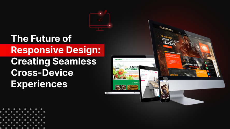
User expectations are evolving faster than ever. With the increasing diversity in devices and screen sizes, businesses must prioritize responsive web design USA to maintain competitive advantage, enhance user experience, and drive conversion. This article dives deep into the future of responsive design and how businesses can create seamless, cross-device experiences that captivate and convert.
The Cross-Device Challenge in the Digital Age
In the early days of the web, designing for a single screen size was the norm. Fast forward to today, users access websites from smartphones, tablets, laptops, desktops, smart TVs, and even wearable devices. This variety has introduced new design complexities:
- Device fragmentation: Multiple resolutions, pixel densities, and interaction patterns.
- User expectations: Consistent experience across all devices.
- Search engine preferences: Google’s mobile-first indexing prioritizes mobile-friendly, responsive websites.
Failure to address these dynamics often results in poor user engagement, increased bounce rates, and diminished trust.
Why Responsive Web Design is Evolving
Traditional responsive design used flexible grids and media queries to adapt content to various screen sizes. While still valuable, these methods are no longer sufficient in isolation. The future of responsive web design USA hinges on a multi-dimensional approach:
1. Advanced CSS and Layout Techniques
Modern CSS modules like Grid, Flexbox, and Container Queries allow designers to go beyond basic responsiveness, offering granular control over layout behavior in varying conditions.
2. Contextual and Behavioral Responsiveness
Design is no longer only about layout. Context-aware design adjusts based on:
- User location
- Device capabilities (e.g., hover, touch)
- Connection speed
- Accessibility needs
3. AI-Powered Personalization
Machine learning is being used to dynamically adjust content layout, typography, and even color schemes based on user behavior patterns, improving both UX and engagement.
4. Variable Fonts and Scalable UX
Instead of fixed type settings, variable fonts allow real-time adaptation to screen size and resolution without performance penalties—contributing to both aesthetics and functionality.
What the Future Holds for Cross-Device Design
Organizations aiming to stay ahead must embrace the next generation of responsive strategies that move beyond just resizing and rearranging content. Here’s what the future looks like:
Design Tokens and Systems
Creating scalable, reusable design tokens helps maintain visual consistency across platforms, accelerating deployment and reducing design debt.
Mobile-First, But Not Mobile-Only
While mobile remains the priority, the design must still cater to desktops and larger devices that remain critical for e-commerce and B2B industries.
Progressive Web Apps (PWAs)
PWAs offer a native-like experience with offline capabilities, responsive layouts, and high performance, all from a single codebase.
Accessibility-First Design
Responsive design must also ensure inclusivity:
- Proper color contrast
- Scalable fonts
- Keyboard navigation
- Screen reader compatibility
How to Prepare for the Future of Responsive Design
Future-proofing your digital presence requires strategic action. Here’s how:
| Step | Actionable Strategy | Impact |
| 1 | Audit current design responsiveness | Identify gaps in UX |
| 2 | Implement fluid grids and modern CSS | Future-ready layout control |
| 3 | Use analytics to understand device trends | Target most-used resolutions |
| 4 | Introduce responsive images and lazy loading | Improve performance |
| 5 | Prioritize speed and mobile-first design | Boost SEO and conversions |
Taking these actions today ensures you’re not only meeting user expectations but also aligning with Google’s standards for responsive content.
Best Practices for Seamless Cross-Device Experiences
- Design for touch and click: Ensure UI elements are large enough for touch and easy to navigate on desktops.
- Test on real devices: Emulators help but always validate the experience on physical devices.
- Embrace content hierarchy: Prioritize essential content across all screen sizes.
- Utilize scalable assets: SVGs and responsive images reduce load times while maintaining clarity.
- Incorporate feedback loops: Use session recordings and heatmaps to refine user journeys.
Make sure to also follow the website design rules USA 2025 to stay compliant with modern digital standards.
FAQs
1. What is responsive web design USA and why is it important?
Responsive web design in the USA context refers to creating websites that adapt to all screen sizes and devices, providing optimal user experiences for the increasingly mobile-centric American audience.
2. How does responsive design affect SEO rankings?
Google prioritizes mobile-friendly websites in its search results. A responsive site ensures faster load times, lower bounce rates, and better engagement—all key SEO factors.
3. Is mobile-first design the same as responsive design?
No. Mobile-first is a design strategy that starts with mobile and scales up, whereas responsive design adjusts layouts across all screen sizes. Ideally, they should work together.
4. What tools help in building responsive websites?
Tools like Figma (for prototyping), Bootstrap or Tailwind CSS (for frameworks), and Chrome DevTools (for testing) are essential in modern responsive design workflows.
5. Can responsive design improve conversion rates?
Absolutely. A seamless, cross-device experience reduces friction, builds trust, and ensures calls-to-action are accessible—leading to higher conversions.
Conclusion
Responsive web design is no longer optional—it’s a necessity for brands aiming to stay relevant. As the digital ecosystem evolves, adopting future-forward strategies for responsive web design USA will not only elevate user experiences but also drive business growth. It’s time to stop adapting reactively and start designing proactively.

