How to Design a High Converting Website Homepage in USA

A homepage is your brand’s first impression. It’s the digital storefront that welcomes your audience, engages them, and subtly nudges them toward taking action. If your homepage isn’t converting visitors into customers, it’s not doing its job. Let’s explore how to design a High Converting website Homepage USA style—built to turn clicks into conversions.
Why Your Homepage Matters More Than You Think
Your homepage is more than a visual treat. It functions as a strategic asset that:
- Directs users to key sections of your website
- Establishes brand credibility
- Highlights your core value proposition
- Builds initial trust
The first few seconds determine if a visitor stays or bounces. This makes homepage design a vital business decision, not just an aesthetic one.
Elements That Make or Break a Homepage
To create a high converting homepage, consider these core elements:
1. Clear and Compelling Value Proposition
Your homepage should instantly answer:
- What does your business do?
- How can it help me?
- Why should I care?
Place your value proposition prominently above the fold in a concise, benefit-driven statement.
An intuitive menu bar helps users find what they need quickly. Include only essential links:
- About
- Services/Products
- Testimonials
- Contact
Avoid clutter. Less is more when guiding user focus.
3. Visual Hierarchy and Consistent Branding
Design your homepage so that eyes naturally follow a flow:
- Header with logo and nav
- Hero section with CTA
- Service highlights
- Testimonials or trust signals
- Footer with secondary links and contact info
Maintain consistent fonts, colors, and image styles to reinforce brand recognition.
4. Trust-Building Elements
A homepage must make users feel confident. Add elements like:
- Client logos
- Security badges
- Certifications
- Testimonials
These visual cues reduce friction in the decision-making process.
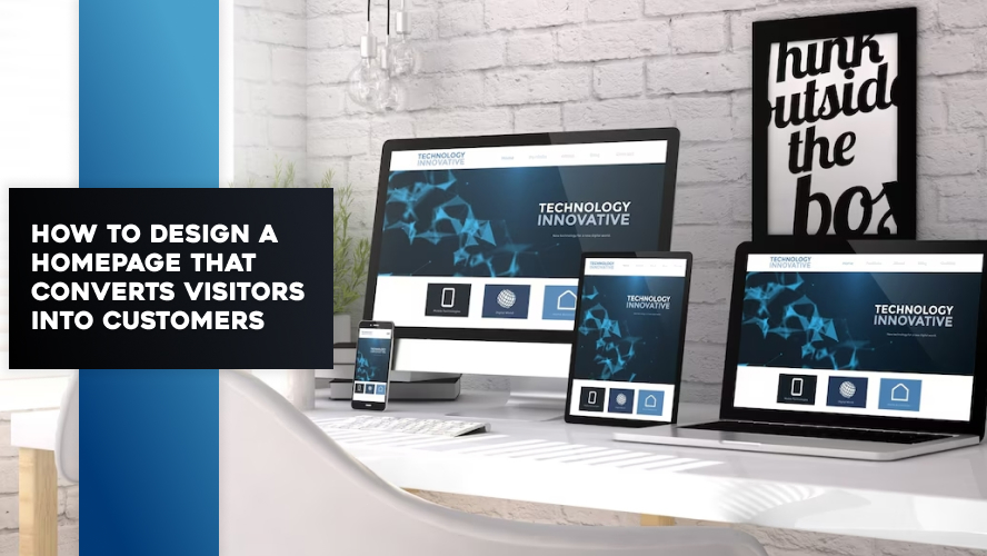
5. Mobile Responsiveness
With over 60% of users browsing via mobile, a responsive design isn’t optional. Your homepage must adapt to all screen sizes without compromising user experience.
Optimize for Conversions with Persuasive Design
Design alone won’t convert visitors. It takes persuasion psychology combined with strategic UX. Here’s how:
Clear Call to Action (CTA)
Each section should guide users toward one action. Use contrasting buttons with active verbs:
- “Get a Free Quote”
- “Start Your Trial”
- “Schedule a Demo”
Use FOMO and Urgency
Limited-time offers or low inventory messages create urgency:
- “Only 3 spots left this month!”
- “Offer ends in 24 hours!”
Implement Social Proof
People trust people. Add:
- Star ratings
- Customer reviews
- User count statistics
“Join over 5,000 businesses already using DesignDerive to scale their digital presence.”
Avoid Website Design Mistakes USA Businesses Make
Many websites lose leads due to common missteps:
- Slow page load times
- Cluttered layouts
- Inconsistent messaging
- Weak mobile experience
Avoiding these website design mistakes USA companies often fall into is crucial for conversion success.
Homepage Design Elements vs. Conversion Impact
| Element | Why It Matters | Conversion Impact |
| Hero Section + CTA | First impression and action trigger | High |
| Testimonials | Builds credibility and trust | Medium to High |
| Responsive Design | User experience on all devices | Very High |
| Fast Load Time | Reduces bounce rate | Very High |
| Minimalist Navigation | Prevents decision fatigue | Medium |
Implement Best Practices Today
Your homepage isn’t just a pretty picture. It’s a lead generation machine. By following these best practices, you can design a high converting homepage USA businesses will admire and customers will love:
- Showcase your value proposition immediately
- Guide the user journey with structured sections
- Build credibility with testimonials and proof
- Ensure your design is mobile-first and lightning-fast
- Avoid clutter and confusing navigation
It’s time to transform your homepage into a conversion powerhouse.
FAQs
How long should a homepage be?
A homepage should be long enough to convey your value but concise enough to keep users engaged. Typically, 3–5 focused sections work best.
Should every homepage have a CTA?
Yes, a CTA directs users toward a specific goal like signing up, booking a call, or purchasing.
What’s the ideal load speed for a homepage?
Aim for under 3 seconds. Faster is better for retention and SEO.
How often should I update my homepage design?
A major redesign every 2–3 years is recommended, with minor updates as your business evolves.
Can homepage design impact SEO?
Absolutely. Clean code, fast speeds, keyword-rich content, and mobile responsiveness boost SEO significantly.
By mastering the elements discussed above, your homepage can go from being a passive digital card to a high-converting, business-building machine. Don’t let another visitor slip through the cracks—start optimizing today.


