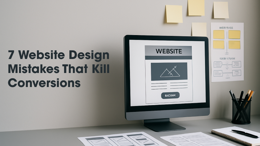
7 Website Design Mistakes That Kill Conversions (website design mistakes USA)
In today’s digital-first economy, your website is often the first impression a potential customer has of your brand. Unfortunately, many businesses unknowingly sabotage their own success by making critical website design mistakes that can severely harm conversion rates.
This guide will help you uncover the seven most damaging website design mistakes USA businesses commonly make, and how to fix them. If you’re a designer, agency, or business owner looking to boost online performance, this article is for you.
Why Website Design Matters for Conversion
Before we dive into the mistakes, it’s important to understand why design plays a vital role in driving conversions. Your site isn’t just a digital brochure—it’s a tool meant to engage, guide, and convert visitors into customers.
A well-designed website will:
- Reduce bounce rates
- Increase user trust
- Streamline the buying journey
- Improve SEO rankings
- Ultimately, increase revenue
But the opposite is also true. Poor design can deter users within seconds. Let’s explore the most common blunders you must avoid.
The 7 Critical Website Design Mistakes USA Brands Make
1. Cluttered Layout and Poor Visual Hierarchy
First impressions matter—and clutter kills.
Many websites bombard users with too much information at once. When everything screams for attention, nothing gets noticed.
Fix:
- Adopt minimalistic, grid-based design
- Use whitespace generously
- Guide users using clear visual hierarchy—headlines, subheadings, and CTA buttons
2. Slow Loading Speed
Speed is a conversion killer if ignored. According to Google, 53% of users abandon a site if it takes more than 3 seconds to load.
Fix:
- Compress images
- Minimize JavaScript
- Use content delivery networks (CDNs)
- Enable browser caching
Quick Speed Optimization Checklist:
| Task | Status |
| Image Compression | ✔️ Yes |
| CDN Implementation | ✔️ Required |
| Minimize CSS/JS | ✔️ Suggested |
| Server Response Optimization | ✔️ Required |
3. Non-Responsive Mobile Design
In 2025, over 65% of web traffic comes from mobile. If your site isn’t responsive, you’re losing conversions daily.
Fix:
- Use responsive design frameworks like Bootstrap or Tailwind
- Test on various devices regularly
- Keep tap targets (buttons/links) large and accessible
When users struggle to find what they need, they leave. Simple as that.
Fix:
- Stick to standard navigation patterns (horizontal top-bar or vertical side menu)
- Include a visible search bar
- Use breadcrumb trails for deeper pages
5. Lack of Clear Call-to-Actions (CTAs)
Your CTA is the bridge between interest and action. A vague or missing CTA leads to missed conversions.
Fix:
- Use action verbs like “Start Free Trial”, “Download Now”, “Get a Quote”
- Make CTAs stand out visually
- Place CTAs strategically: above the fold, end of pages, blog articles, etc.
6. Low-Quality Images and Media
Poor visuals reflect poorly on your brand. They reduce trust and turn users away.
Fix:
- Use high-resolution, relevant images
- Avoid stock photos that feel generic
- Optimize all media for fast loading
7. Unoptimized Homepage Design
Your homepage is often the most visited page and needs to convert quickly. Many USA websites fail by overloading users or offering unclear paths forward.
Fix:
- Focus on a single, primary conversion goal
- Use trust signals (testimonials, certifications)
- Include internal links to key content, like your high converting homepage USA
What You Gain by Avoiding These Mistakes
By avoiding the website design mistakes USA businesses often fall into, you’ll create a seamless user experience that drives:
- More sign-ups and sales
- Increased user trust and satisfaction
- Improved organic visibility through better SEO metrics
- A competitive edge in your niche or industry
Think about it: When was the last time you stayed on a website that loaded slowly or had a cluttered design? Your users are no different.
What You Should Do Next
Don’t let poor design decisions rob your business of its true potential. Here’s how to take action:
- Audit your current website using tools like Google PageSpeed Insights, Hotjar, or Screaming Frog
- Consult professional designers who understand both aesthetics and conversions
- Upgrade your homepage to a high converting homepage USA
- Implement ongoing testing (A/B) to improve CTA placement, colors, and layout based on real user behavior
Need expert help? At DesignDerive, we specialize in designing websites that convert. Reach out today to discover how we can optimize your online presence for real growth.
Frequently Asked Questions
1. How do I know if my website has design issues?
Use tools like Google Analytics, heatmaps, and UX feedback forms. If your bounce rate is high or conversions are low, that’s a red flag.
2. What is the biggest design mistake to avoid?
Neglecting mobile optimization. With the majority of users browsing on phones, mobile-first design is no longer optional.
3. How often should I redesign my website?
Typically, every 2–3 years. However, continuous micro-optimization is better than large overhauls.
4. Why is website speed so important?
Speed directly affects user experience and SEO rankings. A slow site leads to higher bounce rates and lower conversions.
5. What’s the best way to improve homepage conversions?
Have a clear value proposition, use trust indicators, minimize clutter, and feature a strong CTA. Don’t forget to build a high converting homepage USA.
Final Thoughts
Your website is your 24/7 salesperson. Avoiding the critical website design mistakes USA businesses frequently make can significantly increase your ability to convert visitors into leads and customers.
Whether you’re launching a new site or revamping an existing one, always design with clarity, usability, and conversions in mind.